When a logo doesn't risk it all: Designers say Meta's blue infinity symbol is non-threatening
Sign up now: Get ST's newsletters delivered to your inbox

The response to Facebook's change by the design community has been largely muted.
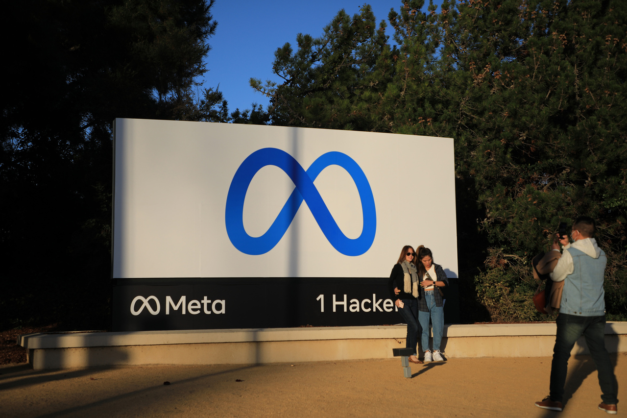
PHOTO: NYTIMES
NEW YORK (NYTIMES) - When Mr Mark Zuckerberg announced last month that Facebook was changing its name, the company published a sleek animation online that showed logos of all its apps and products fusing together to form a shimmering vision of the future: a two-tone blue infinity symbol next to the word "Meta".
The new symbol and name change were nods to Mr Zuckerberg's plans to refocus the Silicon Valley giant towards what he sees as the unification of disparate digital worlds into the metaverse, the immersive, interconnected online space largely enabled by augmented and virtual reality.
"The metaverse is the next frontier in connecting people," he said in an announcement.
To design experts, the change by a scandal-plagued company was the latest example of efforts by corporate America to create brands that are less unique and ultimately less offensive. It was also a reflection of the growing challenge for corporate identities to exist in many sizes and digital settings at once, from virtual reality (VR) headsets to smartwatches - a challenge that is magnified for Meta as it tries to establish an identity for something that largely does not exist yet.
"It checks a lot of boxes," said Mr Michael Evamy, author of Logo, an anthology of corporate brands and logos. "It's very simple. It's very visible at all scales. It's blue."
Blue, he noted, is historically a colour associated with safety and trustworthiness. The infinity symbol, devoid of corners and jagged edges, can be seen as non-threatening.
"But in a way it kind of looks exactly like you'd expect," Mr Evamy added. "Kind of underwhelming and risk-averse."
Users and lawmakers worldwide are increasingly scrutinising the wide reach of Facebook, whose products - including Instagram and WhatsApp - are used by more than 3.6 billion people monthly.
Even as Facebook grew to become one of the most valuable companies in the world, it spent the past several years moving from one embarrassing scandal to the next. Most recently, a former employee turned whistle-blower released a vast trove of internal documents, arguing that Mr Zuckerberg and Facebook routinely placed profit over the well-being of people.
Mr Zuckerberg said last month that the name change was a reflection of how much Facebook had evolved. "Right now our brand is so tightly linked to one product that it can't possibly represent everything we're doing today, let alone in the future," he said.
Facebook has long been associated with its lowercase "f" logo - a simple mark but one that became globally recognisable as Facebook grew. The company's other apps also have bold and colourful logos, which are staying as part of the rebranding.
Because Mr Zuckerberg's future vision rests on virtual reality, the company wanted a new logo that felt more dynamic and immersive. In March, the company began developing a logo by focusing "solely on exploring concepts with motion, dimensionality and perspective", said its in-house designers Zach Stubenvoll, Sam Halle and Marian Chiao, in an e-mail.
When using a VR headset, people often use a controller to draw boundary lines of their virtual experience. Meta's designers said that the colour loop in the new logo that eventually twists into the infinity symbol was inspired by those boundary lines.
The response to Facebook's change by the design community has been largely muted.
"This symbol just doesn't get you excited about the metaverse," Mr Evamy said. "The opportunity they've missed is to produce something really exciting and transformative in its own way."
Many other brands have very similar infinity-symbol logos, including those of Web development software sold by Microsoft, a model of Top Flite golf balls, a wealth management firm and the rock band Hoobastank. A service owned by Meta called Boomerang also uses an infinity symbol.
"An infinity loop is not very unique," said Ms Jessica Walsh, founder and creative director of the design studio &Walsh. "However, unlike many brands, they're in a privileged position where they don't need to rely on their logo being distinct for it to be memorable," she added.

<p>FILE PHOTO: A Facebook logo is displayed on a smartphone in this illustration taken January 6, 2020. REUTERS/Dado Ruvic/Illustration/File Photo</p>
PHOTO: X02714
Ms Paula Scher, a partner at Pentagram, a design consultancy whose clients include Bloomberg, Citibank and Tiffany, said she had seen a growing push for corporate brand logos to have motion and be multidimensional. Several years ago, for example, Google added animation to its logo. But Ms Scher pointed out that making a logo more flexible risks making it less recognisable.
Mr Rodrigo Corral, a book cover designer who has also worked with the rapper Jay-Z and the Metropolitan Museum of Art, often incorporates animation in his design work for clients.
"But the logo has to stand on its own," he cautioned. "It has to work without motion first."
In recent years, brands have had to adapt their logos and identities to a wider array of digital platforms. As websites once solely viewed on desktop computers gave way to smartphone apps, logos have had to function in smaller and smaller contexts - tiny squares and circles in social media feeds or miniature dots on smartwatches. Virtual reality offers yet another platform for brands to adapt to, one that is inherently defined by motion and 3D.
Mr Evamy noted that the new Meta logo was a departure from an era when corporate branding used to be much more evocative.
"Big companies used to produce very brave, exciting, striking and stop-you-in-your-tracks symbols," he said, pointing to the iconic stripes of IBM or the hidden arrow inside FedEx's name.
But whereas a company like FedEx traditionally had to concern itself with branding on the side of a delivery truck and in TV commercials, Meta lives predominantly in the digital world across various platforms.
It is relatively uncharted territory. There is little precedent for corporate logos that can exist in 3D within a virtual space where they can be interacted with and manipulated by a user.
"Our Meta design system is designed to grow and change with the company and as the metaverse is created," Meta's design team said in the e-mail. "We needed to future-proof the symbol."


