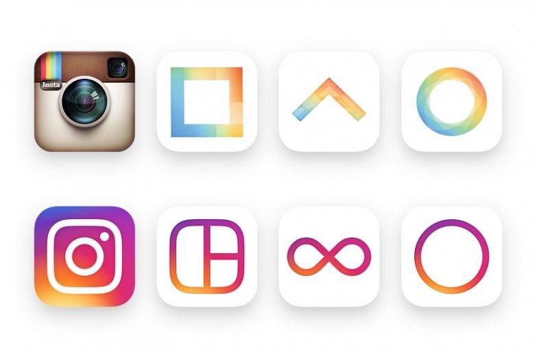
Mobile photo-sharing app Instagram has dispensed with its iconic, retro-looking logo in favour of a major revamp.
Unveiling the new look in a blog post on Wednesday (May 11), the Facebook-owned brand - it was acquired in April 2012 for about US$1 billion (S$1.4 billion) - said its design was inspired by the previous app icon.
"The new one represents a simpler camera and the rainbow lives on in gradient form," it added, referring to the logo's white outline of a camera against a warm swirl of orange, yellow, pink and purple.
"The Instagram community has evolved over the past five years from a place to share filtered photos to so much more - a global community of interests sharing more than 80 million photos and videos every day."
"Our updated look reflects how vibrant and diverse your storytelling has become."
A longer post by head of design Ian Spalter on Medium further delves into the new logo's design process.
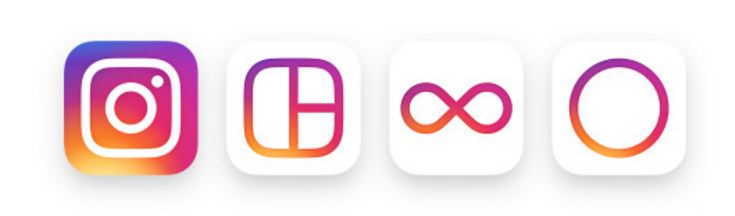
The logos for its three accompanying creative apps - Layout, Boomerang and Hyperlapse - have also been updated.
On the inside, Instagram said improvements have been made to how the app looks. There is now more focus on a user's photos and videos, without changing how the app is navigated.
Users, however were split over the new logo. While some lauded its simplicity, others bemoaned the loss of the old logo's retro feel.
Posting in the comments section of the Vimeo video showcasing Instagram's new look, user Kyle Popovich wrote: "Just the worst, laziest, colour vomit design. Sometimes simple isn't better. Stop trying to be trendy."
In an update on September 2015, Instagram announced it had more than 400 million users who share 80 million photos a day.