Netizens react to new Singtel logo and slogan
Sign up now: Get ST's newsletters delivered to your inbox

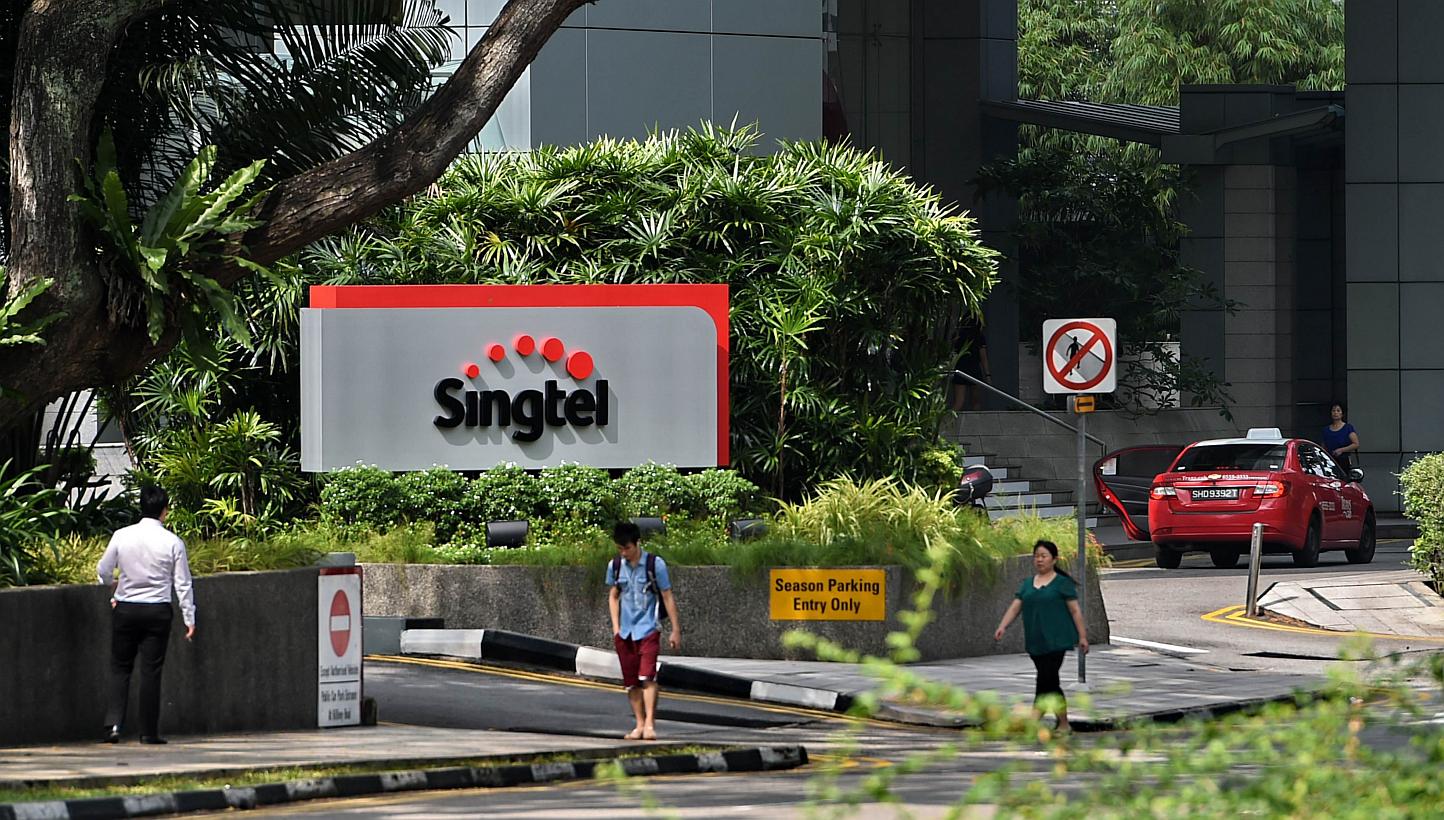
Singapore Telecom's (SingTel) new logo displayed on its building in Singapore. -- PHOTO: AFP
SINGAPORE - The new Singtel logo unveiled on Wednesday has created quite a buzz. it also came with a new slogan "Let's make everyday better", and new service commitments by the telco.
The rebranding and logo - the first in 16 years - were conceptualised by creative agency Ogilvy and Mather. The logo and slogan did not get the best reception online, it seems.
The five dots that form an arc above "Singtel" generated some reactions, like:
//
Entrepreneur Calixto Tay wrote in Alvinology.com that the "new logo isn't making too much sense", and even asked two designers to come up with some new ones. Those by designer Jeremy Kieran featured the 'T' in negative space, and in one, it was made to look like an upward arrow.
There was some discussion as to whether the slogan was grammatical, and Facebook user Sergio Gs IIo wrote: "there is an even worse error: it should have been 'everyday better-lah'"
//
Consumers welcomed the promised improvements in customer service, of course.


