Explaining the news in visual, interactive ways
Sign up now: Get ST's newsletters delivered to your inbox

Through 3D models, readers can better compare and visualise the changes in the layout of two Toa Payoh flats built in the 1970s and 2020 respectively.
PHOTO: ST DIGITAL
SINGAPORE - How has the design of Housing Board (HDB) flats changed over the years?
What led to the global supply chain disruption that is threatening to ruin Christmas for some?
Readers of The Straits Times can explore visual, multimedia stories on a broad range of local and global issues lined up for this month and beyond.
These multimedia stories use illustrations, interactive graphics and data visualisation to break down complex information and topics that may be hard to explain in just words.
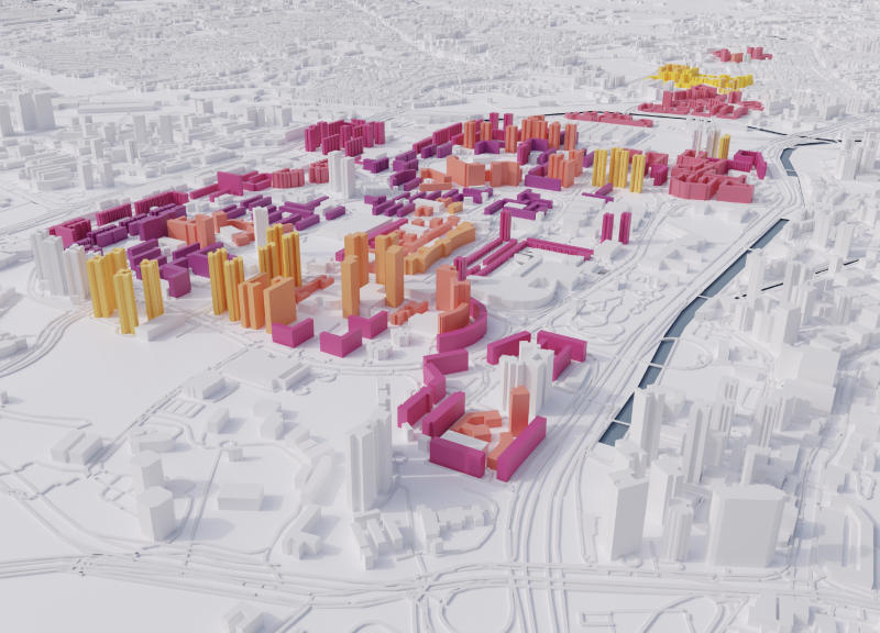
One such example was a project looking at how the design of HDB flats has evolved over the years. Through 3D models, readers can better compare and visualise the changes in the layout of two Toa Payoh flats built in the 1970s and 2020 respectively.
Another project delved into the disruptions affecting the global supply chain, a complex topic that has been widely reported, but rarely through simple visuals and illustrations.
To make the topic more relatable, animated illustrations were used to compare how long it took a China-made bicycle to arrive in Singapore - before and after the supply chain crunch. To show the congestion at some of the world's major ports, satellite imagery was used, which served as a good contrast to the illustrations.
"It was a dedicated effort by ST correspondents based in different countries to investigate the issue - from speaking to various parties involved in the supply chain to tracking vessels through satellite images," said ST senior correspondent Joyce Lim, who covered the story from Singapore.
"We discovered that the problem is more complicated than just the delay in the arrival of goods. Our story goes back to the beginning of the crisis and, using interactive graphics, we try to explain why the crisis is not going to be over soon."
While seaports were plagued by congestion, airports around the world were facing a massive drop in traffic due to Covid-19 border closures.
A project launched last week looked at the impact of the pandemic on the aviation sector, and whether the launch of vaccinated travel lanes has brought signs of recovery to Singapore's air travel industry.
The ST team tracked the number of flights departing from Changi Airport over the last two years, to help readers see the extent of the impact on the airline sector.
Animated charts were used to present the information in an engaging manner. The interactive graphic also included a quick guide for vaccinated travellers who are hoping to cure their wanderlust this holiday season.
These multimedia projects often involve reporters, designers, developers and data journalists working together, and usually take weeks and even months of planning and combing through data sets to create compelling graphics.
The goal is to help connect readers with context and meaning in simple but powerful ways, said interactive graphics correspondent Rebecca Pazos.
"Using memorable visual metaphors with graphics, illustrations or even animations helps us to deliver insights from data in compelling ways."


