The Chic Home: Colourful Queenstown flat a space for four kids to learn and play
Sign up now: Get ST's newsletters delivered to your inbox
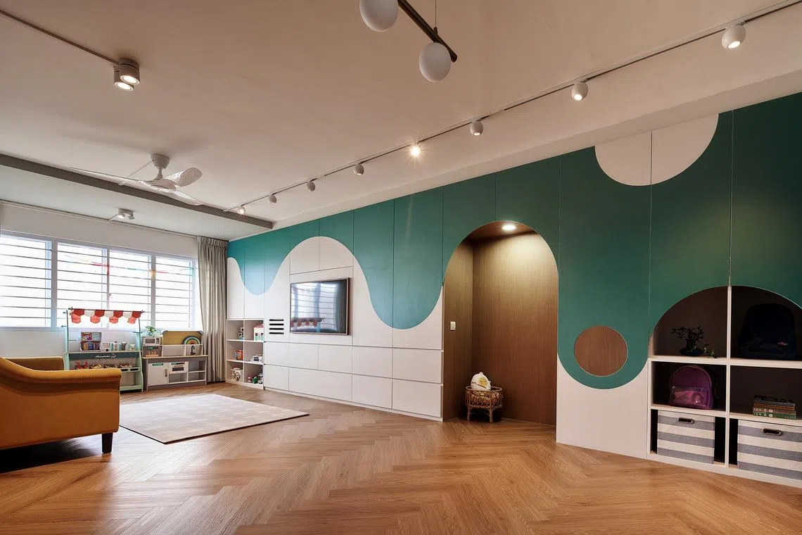
The living area has plenty of space for the kids to play. The only ceiling features here are track lights, creating an airy feel.
PHOTO: M ATELIER
DeeperDive is a beta AI feature. Refer to full articles for the facts.
SINGAPORE – When their triplets came along, Marco Low and Mavis Long, both 37, realised their four-room BTO flat was too small for their growing family.
They chose a 30-year-old Queenstown executive apartment for themselves and their four children. M Atelier founder and interior design director Megan Zhang, who had worked with the couple previously, was in charge of the home’s look.
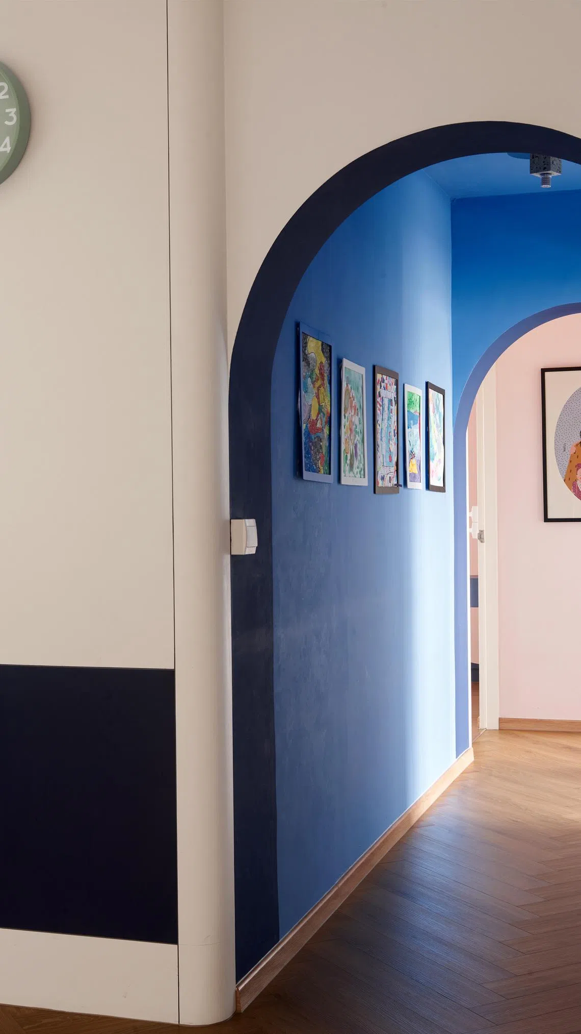
The passageway to the bedrooms is a gallery displaying the kids’ artworks. Blue paint draws attention to the space.
PHOTO: M ATELIER
The $146,000 renovation of their new 1,592 sq ft space included a liberal use of colour. “We wanted our kids to come home and be happy with the environment. Brighter colours tend to evoke such feelings,” says Mr Low, a legal counsel. His wife is a clinical psychologist.
While their former home had bursts of yellow, they wanted something more evergreen this time. The palette comprises blue, green and pink. Swathes of white balance the combination.
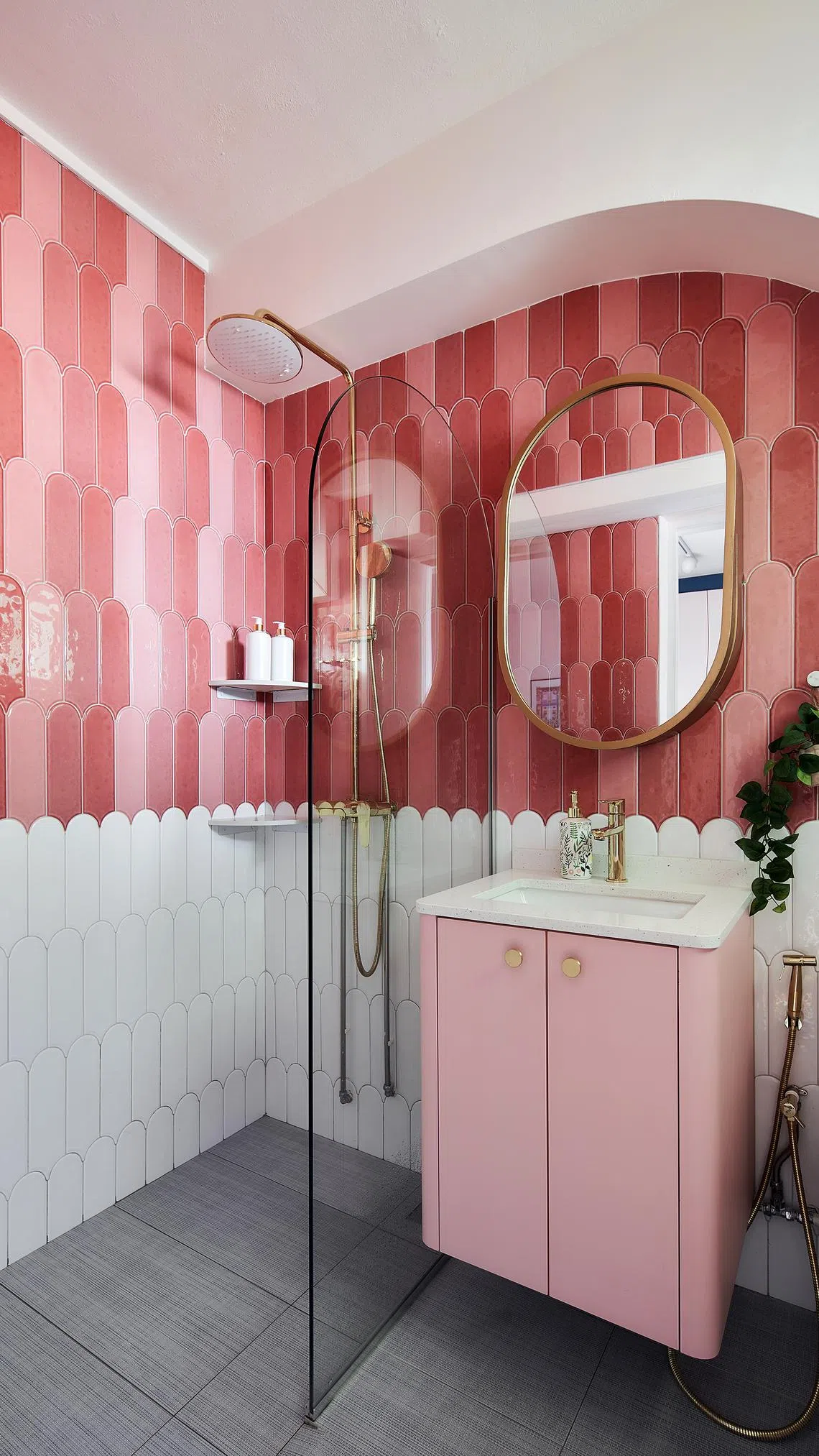
The pink master bathroom exudes fun, joy and positivity. Curved edges ensure consistency with the home’s overall theme.
PHOTO: M ATELIER
Mr Low says: “In our previous home, we tried to put in more colours all the time. For the master bedroom this time, there is pink, but it is not excessive for us.
“The colour choices were carefully curated because we wanted them to remain relevant over the years.”
Ms Zhang says: “We were mindful of the proportion of the colours and we created a structure for the use of colours. For example, the master bedroom had pink walls, laminates and a velvet headboard in the same tone.”
Getting the right tone for each colour to work well together was a big part of the process, she adds.
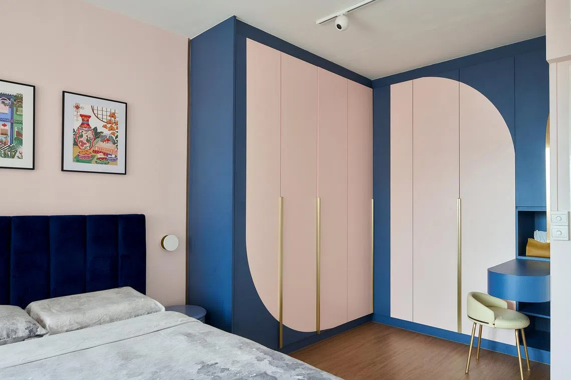
Blue and pink make an engaging yet relaxing combination for the master bedroom.
PHOTO: M ATELIER
Spatial planning was another significant aspect of the renovation.
The balcony is now part of the living area, a wall was removed to create an open-concept kitchen and the study has been converted into a bedroom. The storeroom of the flat was removed to create a bigger master bedroom.
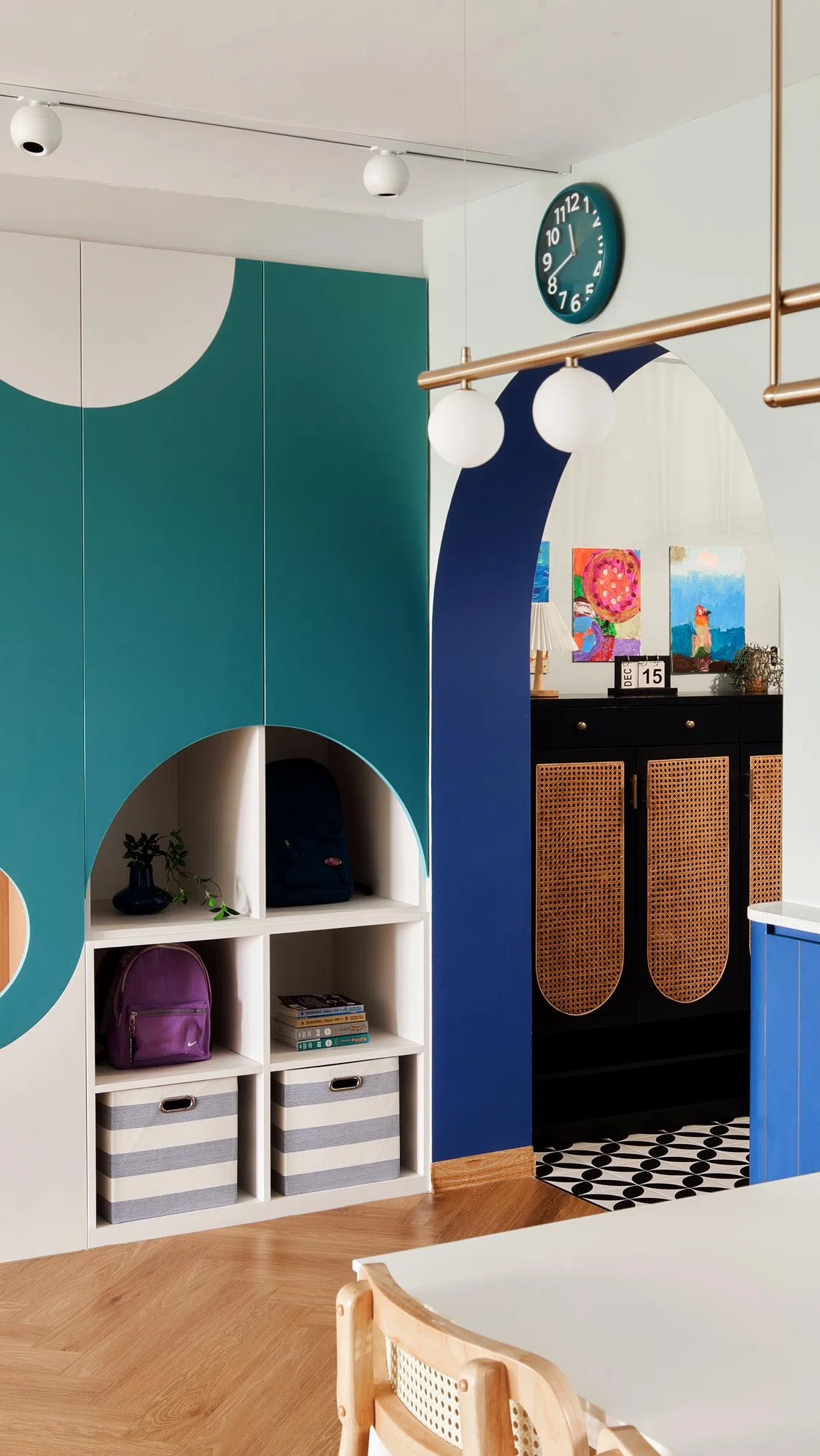
A storage area has been built at a child-appropriate height so the kids can manage their own belongings.
PHOTO: M ATELIER
To meet the family’s storage needs, the design team added storage hidden in the feature wall stretching across the living area. In the dining area, a half-height wall feature leads towards the kitchen counter.
Mr Low says Ms Zhang suggested practical solutions, such as the extra washing area in the kitchen.
“Megan was telling us that after a meal, we might not have enough space to wash the kids’ hands. Having the washing area outside the bathroom might not be intuitive, but she pointed out the necessity,” he says. As it turned out, the family uses this area extensively.
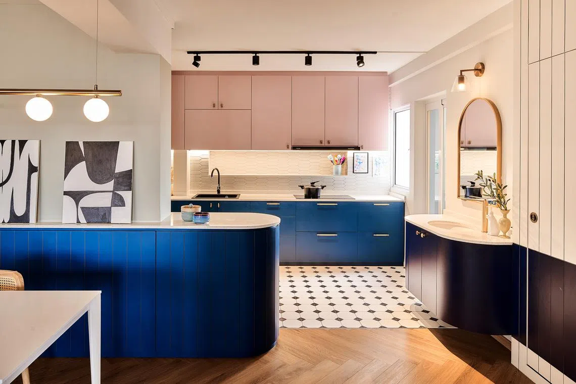
An open-concept kitchen with an extra washing area lets the parents go about their tasks while keeping an eye on the kids.
PHOTO: M ATELIER
In terms of design, the curved edge of the kitchen counter is exemplary of the visual language throughout the apartment, where curves frame areas or embellish surfaces.
This concept kicked off with curved edges for furnishings, which were initially intended to make the home kid-friendly.
Arched doorways at the foyer and the walkway to the bedrooms create a welcoming atmosphere. Wavy lines on the feature wall in the living area jazz up the home.
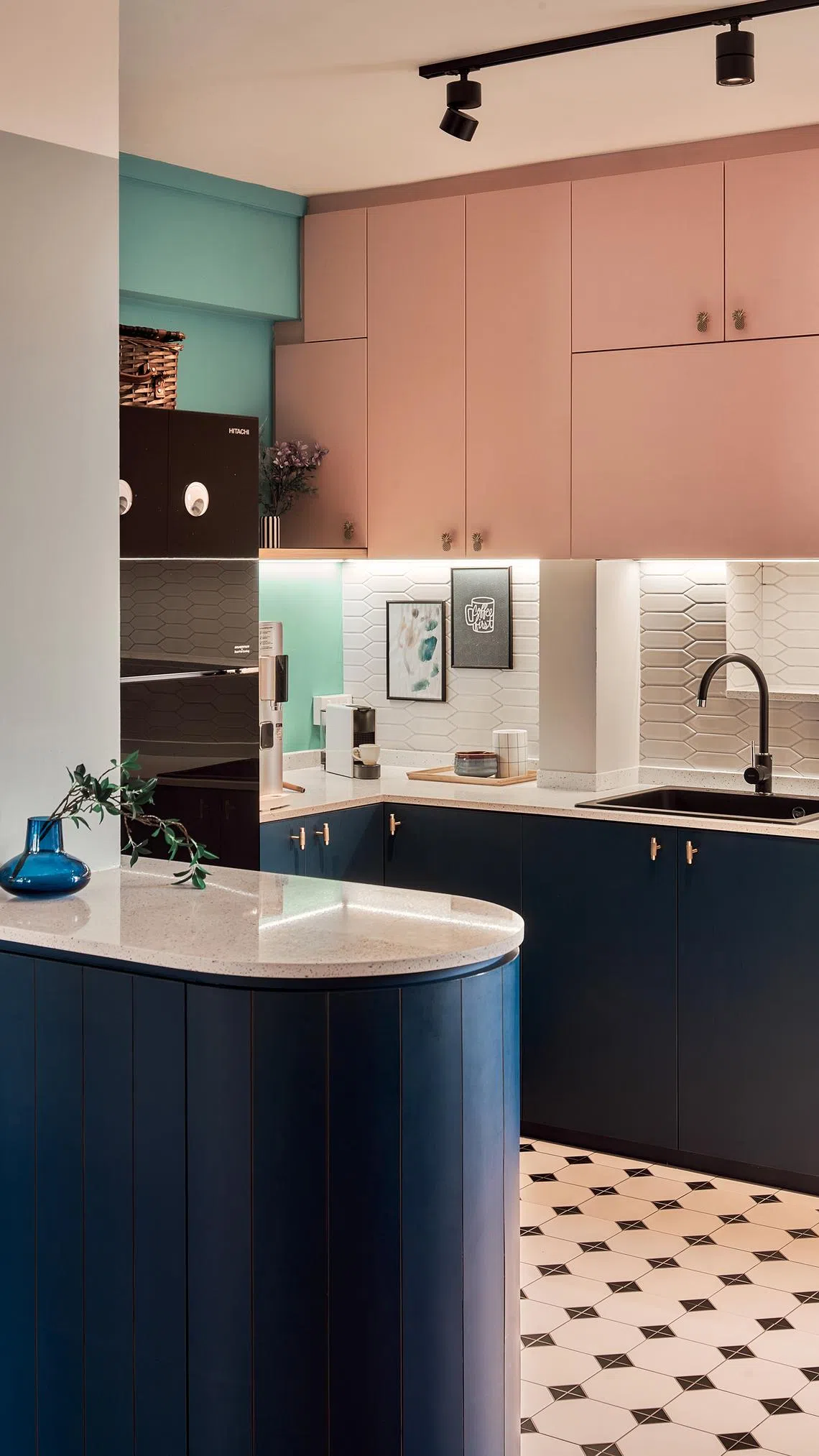
Removing a kitchen wall created more counter space.
PHOTO: M ATELIER
“Sometimes, we had crazy ideas that would sound nice on paper. Megan would point out to us that we needed to be practical and not fall into the trap of looking good so much so that it wouldn’t be practical,” says Mr Low.
Most design solutions were crafted with the family’s needs in mind. Growing children need space to roam, explore and learn, and the home was designed to cater to that.
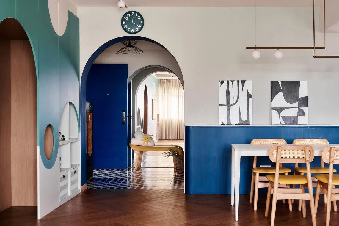
Lighting is kept simple to complement the rounded edges throughout the home.
PHOTO: M ATELIER
Mr Low says of his kids: “They are just starting to learn how to read. That was why we set aside a special reading corner. Play corners can be rotated as they grow and the spaces allow that to be done easily.”
This article first appeared in Home & Decor Singapore. Go to homeanddecor.com.sg for more beautiful homes, space-saving ideas and interior inspiration.


