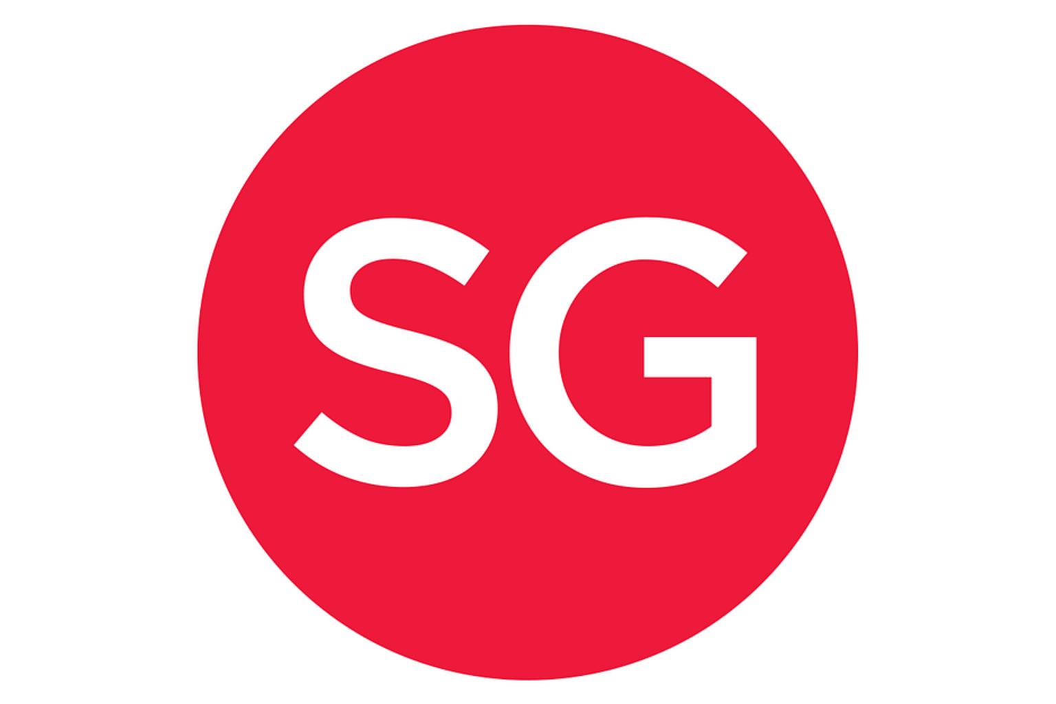
Post-2015, SG50 logo lives on in altered form
Sign up now: Get ST's newsletters delivered to your inbox

A new logo was revealed on the official SG50 Twitter page on Friday morning (Jan 1).
PHOTO: SG50/TWITTER
SINGAPORE - Goodbye SG50, hello just "SG".
As Singapore bid farewell to 2015, the nation's 50th year of independence, a new logo was revealed on the official SG50 Twitter page on Friday morning (Jan 1).
"Let us welcome our new 'SG' logo - it represents our kindling Singaporean spirit that lives in the things we do..." said the tweet.
The SG50 logo was designed by Mr Jackson Tan, the creative director of Black, a branding and design agency .
The logo was ubiquitous in 2015, and was emblazoned on every collateral and product related to Singapore's Golden Jubilee.
It spawned memes and hashtags, and some moaned that it was on everything - including fishcakes.
But the simple red circle with letters in a bold white Gotham Typeface font certainly has caught on, and it seems that a version of it is here to stay.
On the SG50 Facebook page and Instagram, a short animation showed the SG50 logo tranforming into the SG logo in the midst of fireworks.
The Facebook post read: "With every end comes a new beginning. Some exciting changes are happening, so stay tuned to find out what!"
The SG logo is being used in on the website of the SGfuture dialogue series launched last month. It is led by Minister for Culture, Community and Youth Grace Fu and Minister in the Prime Minister's Office Chan Chun Sing.
During the dialogues, Singaporeans will discuss issues such as building a sustainable home and fostering a caring community among others.
Members of the public can share their thoughts and sign up for dialogues at the website.


