Unlike restaurants, hawkers do not have multi-page menus that detail the stories behind their food, nor a dining room to immerse guests in their culinary vision. All the information about who they are and what they offer has to be communicated through the slim, rectangular lightbox perched above their stalls.
Most hawkers have the freedom to pick the colour and style of their sign, provided they adhere to the National Environment Agency’s (NEA) guidelines, which advise on permissible sizes and locations.
Signage companies typically do not use a standard template, instead customising each design based on the client’s needs.
What’s in a sign?
“We start by understanding every customer’s preferences, products, services and target audience, and if there is any story behind its branding,” says Ms Anthea Tan, 33, key account director of Big Image Group, a company that makes signs.
This is where language, colour, font, photography and text come into play. Let’s look at how each component conveys a different message.
Colour
Loud colours – such as red, gold and blue – tend to be favoured by older hawkers for cultural and practical reasons, says Ms Tan.
Red in particular symbolises good fortune and is said to attract positive energy, as do yellow and gold.
“It’s a powerful colour, the hue of royalty and success,” says 65-year-old hawker Melvin Ong. He runs Kheng Hai Hui, a drink stall with a bright yellow signboard at ABC Brickworks Market & Food Centre.
While blue is less closely associated with prosperity, it contrasts strongly with white and yellow text, making for an eye-catching combination. Blue might also convey a sense of trust and reliability – qualities older hawkers pride themselves on.
These primary colours, however, may prove too loud for some younger hawkers, who prefer a sleek, minimalist sheen. They therefore opt for subtler palettes of whites, greys and blacks.
Here’s how different colours have come to be associated with different types of food
Layout
Some hawkers choose to keep their signs clean, focusing mainly on the text. Others crowd the board with photographs – some taken themselves or sourced from their sign-maker’s stock archive – giving customers an idea of what to expect.
Here’s how hawkers play with space
“We want to show customers what we sell, instead of writing it down. We have customers of all races, and some might not know what our dishes look like,” says Mr Habib Sultan, 31, who helps to run Habib’s Power Mee Stall at ABC Brickworks Market & Food Centre.
On its sign, plates of nasi goreng, mee goreng and roti john pop against a bright green backdrop, with text kept to a minimum so as not to draw attention away from the photos.
Fellow hawker Chen Yi Wei, 38, on the other hand, wants something more futuristic for his stall at the same Bukit Merah hawker centre. Kine serves experimental burgers to younger diners, and he needs a way to stand out in a mature estate.
I’m constantly innovating and changing the menu, so this is more flexible.
“One young customer told me it’s the coolest he’s seen,” the former pastry chef says of his Tesla-inspired signboard: a metallic strip with only the word “Kine” emblazoned in LED letters. His menu is displayed on a separate TV screen.
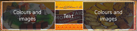 We analysed how space is used in the hawker signs and assigned scores for how much colour is used, as well as how much text occupies the space.
For instance, this Malay kueh sign stands out for its vibrant design. Nearly 80 per cent of the space is filled with colours and images, while only 7 per cent is taken up by text. It ranks among the most colourful signs in our analysis.
This Nam Kee Pau sign sits on the opposite end of the spectrum. Its space is less dominated by colours and images, with text occupying about 43 per cent of the signage area.
While many of the signs analysed feature more colours and images than text, there are no regulations governing hawker sign design or layout, hence allowing each stall owner complete freedom in deciding how his or her sign looks.
Text and fonts
Hawker centres, as microcosms of Singapore’s multicultural society, naturally reflect its linguistic diversity too. Here, stalls bearing the Hokkien names of their owners sit cheek by jowl with signboards inscribed with Tamil characters or Arabic praises.
English, the most widely spoken language in Singapore, can be found on most signs. It is usually accompanied by another language – typically the stall owner’s mother tongue.
According to Dr Cher Leng Lee, associate professor of Chinese studies at the National University of Singapore, hawker signs are one linguistic domain in which government intervention is largely absent.
She thinks that is because the language used in the signs was never the Government’s top priority. Rather, when hawker centres were first set up in the 1970s, hygiene was the more pressing issue.
She calls the hawker centre “a habitat that captures both old and new identities, reflecting the coexistence of changes in language policies, and the nature of Singapore’s diasporic heritage”.
For instance, as Dr Lee observed in a paper on the linguistic landscape of hawker signboards in Singapore, published in the Journal of Asian Pacific Communication in 2024, the presence of pinyin on signs grew more widespread after the Speak Mandarin Campaign. It was launched in 1979 to encourage Chinese Singaporeans to use a standardised lingua franca instead of regional dialects.
Culture also informs the specific words and phrases used in these signs, which may take the form of blessings or auspicious sayings.
Muslim stalls appeal for divine favour. Here, the signs for Dapur Indah and Pakistani Dum Biryani SG have the Islamic invocation “Bismillah ir-Rahman ir-Rahim”, a phrase Muslims often recite before starting any task.
Or stalls might court prosperity by incorporating words like 成, representing success.
Other Chinese stalls invoke blessings through auspicious words. 福 here means blessing and 顺 connotes smoothness.
The X Factor
Sometimes, striking colours, unique designs and appealing visuals are not enough to win over diners. What tips the balance in favour of some stalls is their claim to fame.
This might take the form of newspaper clippings or media features, as in the case of Sin Thor Eunos Bak Kut Teh Kway Chap at ABC Brickworks Market & Food Centre. Second-generation owner Donovan Tan, 40, has accumulated a stack of endorsements over the five decades that his father’s stall has been in business – so many that they cannot all fit on his recently updated sign.
I wanted to make the sign look trendier, not so old-school. But I still wanted to keep these features because they help to attract customers.
Ten clippings have made it to his white signboard, a mixture of celebrity photographs, award certificates, magazine columns and TV features.
Alternatively, a stall might legitimise itself through longevity: a decades-old establishment date stamped on the top of its signboard or a name that promises a taste of tradition. These are all attempts to appeal to nostalgia and tap the kind of trust engendered by years of reliable service.
In increasingly health-conscious Singapore, nutritional claims are gaining traction too. A juice stall might claim to promote a healthier lifestyle, as opposed to, say, a sugary cup of kopi. Or a herbal soup stall might proudly advertise its lack of monosodium glutamate or MSG, so health-conscious diners can slurp away in peace.
At some hawker centres, this is a deliberate directive. Hawkers at Bukit Canberra Hawker Centre display a CAN meal – a dish with fewer than 500 kilocalories prepared using healthier cooking methods and ingredients – on the left side of their signboards.
Like any business, the goal for many hawkers is to become a household name. And one way to do so in this digital age is by building up an online following.
So, some stalls plug their social media accounts – usually Instagram – on their signboards, in the hope that customers will continue engaging with their brand after they have finished their meal.
How effective are these strategies?
The Straits Times surveyed more than 100 people of various ages to find out what draws their attention at a hawker centre.
Unique logos and mascots also offer an incentive, with over half the respondents saying they are more inclined to try a stall with such features.
For customers seeking authenticity, signs that feature dialects help: 42 per cent of respondents say offerings at those stalls appear more authentic. But it is the inclusion of a date that might prove the strongest marker of tradition, with 57 per cent of respondents associating the invocation of history with authenticity.
Overall, visual preferences do not differ much across age groups, all of whom value clean and professional signs with good photos. The one anomaly is this: While those between the ages of 45 and 54 rank a stall’s name as one of the most important pieces of information in a sign, patrons aged 18 to 24 hardly factor that into their decision-making process.
At the end of the day, however, only 29 per cent say the design of a stall’s sign influences their decision to give it a try. Most – 45 per cent – are more ambivalent, saying that their dining choices are only somewhat shaped by this element.
According to Dr Seshan Ramaswami, associate professor of marketing education at the Singapore Management University, signs have the biggest impact on occasional visitors, “for whom visual imagery is what makes the first impression”.
He adds: “But whether it translates into a sale depends not on the visual appearance of the sign, but the combination of assortment, price and indications of quality – for example, a long line of customers waiting to be served. Or perhaps a review or rating average online.”
For regulars who live and work in the neighbourhood and are likely familiar with the hawker centre’s offerings, on the other hand, mere changes to signage will probably make little difference.
Signs of the future
It is a sign of the times that English has started to replace vernacular languages on hawker signboards. As young hawkers experiment with international cuisines such as burgers and rice bowls, sleeker designs that are less cluttered with the trappings of tradition – for instance, dialect names or auspicious symbols – become more representative of their identities and offerings.
Kine’s Mr Chen knows older patrons care little for his futuristic sign. But he is sticking to his guns and brand.
To Dr Lee, the disappearance of dialect comes as little surprise, given its declining use among Singaporeans. The 2020 Census of Population, conducted by Singapore’s Department of Statistics, reported that the use of dialects at home fell from 14.3 per cent in 2010 to 8.7 per cent in 2020.
It’s like losing our roots. Us being a diasporic society, diversity actually makes us who we are. It makes us more interesting.
But for now, hawker centres remain among the last bastions of these vanishing languages. While certain terms such as ham chim peng or tau kwa pau may eventually fade away, popular favourites like bak chor mee, hokkien mee and char kway teow are not going anywhere any time soon.
“You can’t entirely escape dialects in hawker centres because food names are so entrenched,” she says.
As the light shifts, the signboards that line the rows of these communal dining rooms may take on different hues and shades. But what is inscribed on them remains constant: the same multicoloured tangle of identities – the beliefs, preferences and aspirations of a small and hungry island of people eating their way through time.