NEW YORK • Spider-Man: Into The Spider-Verse follows the adventures of an Afro-Latino teenager, Miles Morales, who has been bitten by a radioactive spider in New York City and joins forces with other Spideys from alternate dimensions.
It is one of the animation surprises of the season: both a box-office hit and a critical favourite (certified 97 per cent fresh on Rotten Tomatoes) that has been collecting awards, even winning best picture from the Utah Film Critics Association.
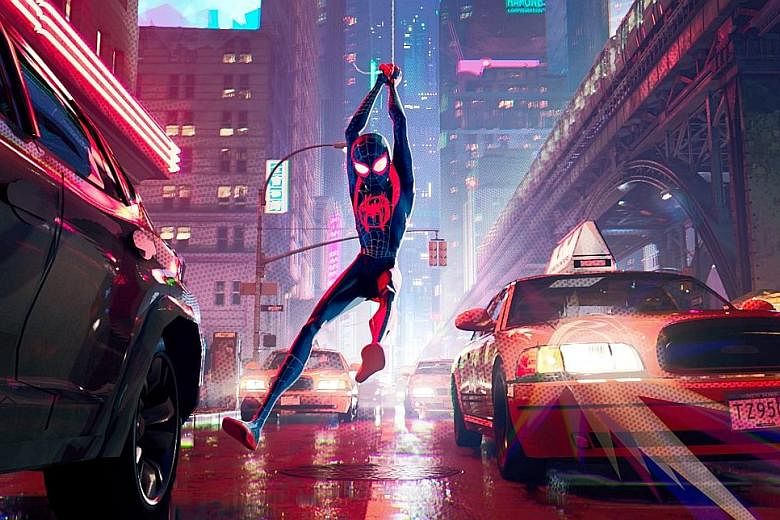
One reason is the fresh animation style that sets it apart from the year's other releases.
Spider-Verse celebrates its print origins with bold graphics and mainstays of comic-book style, including thought balloons, printed words and wavy lines to indicate a tingling Spidey Sense.
Many recent American animated features look homogenised. More powerful computers and sophisticated software have made it possible to produce intricately detailed backgrounds and characters: You can see every leaf on every tree and every stitch in a sweater. But characters of all shapes and sizes seem to have very similar walks and runs and expressions.
Spider-Verse's three directors - Bob Persichetti, Peter Ramsey and Rodney Rothman - wanted to move away from that sameness, in part because Miles is so unlike the Spider-Man fans know from the live-action movies.
"That made it doubly important for the film to look new, so viewers would feel like they're seeing Spider-Man for the first time," Ramsey said. "We couldn't rest on the conventions of animated films as we've known them."
One of the first decisions they made was to eliminate motion blur. In live action, some movements are so fast, the images appear smeared in individual frames of film.
Computer animation can simulate the effect, giving the imagery a smoother feel; eliminating the blur produced more staccato accents.
"When we decided to strip out motion blur, the people at Imageworks said, 'That's not going to work, you won't be happy,'" Persichetti said of the animation studio behind the film.
"We said, 'No, that's the goal: Make us unhappy. Then figure out a new way to make us happy.' We're creating incredible images in this movie and we want to see them as clearly as possible, so let's not soften them."
The artists made a bigger decision to break with the way most computer-animated motion is achieved. Usually movements are created by advancing the image - say, a character raising his arm - in each frame, 24 times per second. It is called "animating on one's". The resulting motion is fluid and smooth, but it can look too regular, even stolid.
Having worked at Disney with the Oscar-winning animator Glen Keane (whose characters include Aladdin, Beast and Tarzan), Persichetti wanted to borrow ideas from hand-drawn techniques.
In traditional animation, much of the movement is done "on two's": A new drawing is made or the image shifted every second frame.
Using animation on two's gave the artists more control over the speed and power of the movements. Much of the animation in classic Disney features and Warner Bros cartoons was done on two's.
Working on one's and two's let the artists vary the rhythms of movements. When a scared Miles dashes through a snowy forest, his run is animated on one's to emphasise his speed. When he stumbles and falls, he rises on two's as he slowly pushes against gravity to get back on his feet. And when he leaps from skyscraper to skyscraper, the animation crackles with an energy it might otherwise lack. The motions themselves become exciting to watch.
The animation also allows the film-makers to stress dynamic poses that telegraph how Miles is leaping and spinning through Manhattan.
Screenwriter-producer Phil Lord said: "Telling stories in sequential art is all about the key pose and going from pose to pose and frame to frame. Stan Lee laid it out in How To Draw Comics The Marvel Way."
But even the most exciting movements become empty exercises if they do not contribute to the understanding of the characters.
As he learns to control his newly acquired powers, Miles moves with more skill and confidence. He is growing into the role of Spider-Man, but he is also growing as an individual.
The joy of his increasing strength and new friendships is balanced against the sorrow he experiences in his adventures. His movements and expressions reflect a new maturity.
During production, one of the directives was that "if it looks and feels like something from an animated film, it's not our movie", Persichetti said. "I think audiences are responding to that because it's something they haven't seen."
NYTIMES
• Spider-Man: Into The Spider-Verse is showing at cinemas.