
SINGAPORE – For discerning home owners, finding the right design team is no easy feat. Luckily, the owners of this 1,593 sq ft Housing Board maisonette in Hougang met the team from local design studio DISTINCTidENTITY not long into their search.
The concept given by the owners – who did not state their full names or occupations, and have two children – was inspired by black and white British colonial bungalows, as well as something that would fit the family’s lifestyle.
The eight-week renovation cost around $70,000, not including furnishings, and the family moved in during the last week of July 2021. The design team reveals more about the process here.
Can you tell us more about the style of the home?
The owners like bold styles — their previous home was decorated in the style of a modern resort. They wanted this home to incorporate their flamboyant personalities and balance it with the monochromatic elements of colonial houses. What better way than to incorporate statement pieces with bold black elements?
The open kitchen stands out with the vivid blue. What were the requirements for that space?
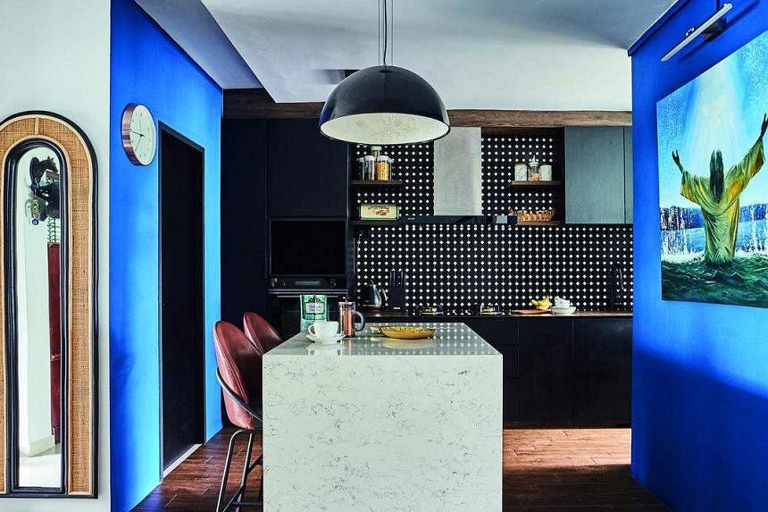
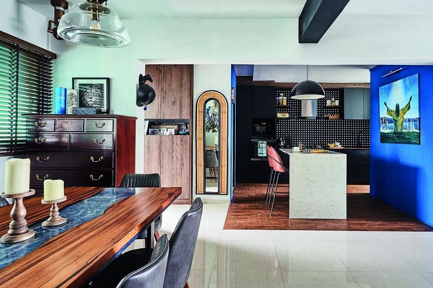
The main idea was to make the closed-off and dark kitchen more spacious, and connect the different areas into one big space. We set up a waterfall island counter where the wife could bake.
It not only provides additional counter space and storage for electrical appliances, but also space for the children to sit in the kitchen with their mother and help with the chores.
As the owners host frequently, they wanted guests to access the powder room from the living area, so we closed off the original entrance from the kitchen and made it accessible from the passageway. This freed up space for a laundry area with a dedicated sink, washing machine and dryer.
In addition, the owners wanted to hang a painting on the feature wall, so we added blue to brighten the room. The blue is also reflected in their custom dining table from De Woodscape.
We also love the bar area.
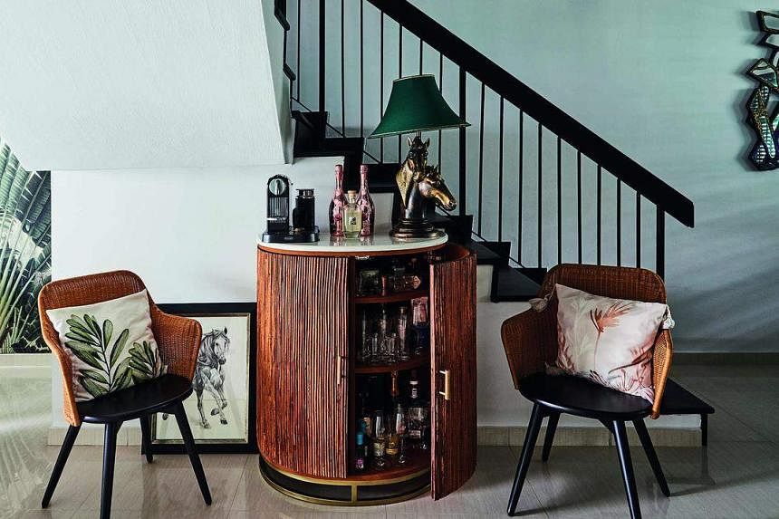
We wanted to create a foyer, so we used the empty space next to the stairs for a standing bar and found two statement rattan chairs that echo the wood elements in the living room.
How did you curate the furniture?

The owners sold their previous home with all its furniture and decor. Everything was newly purchased to fit the theme. Some of the items were bought from second-hand stores.
What was the inspiration for the terrace and what were the challenges of designing it?

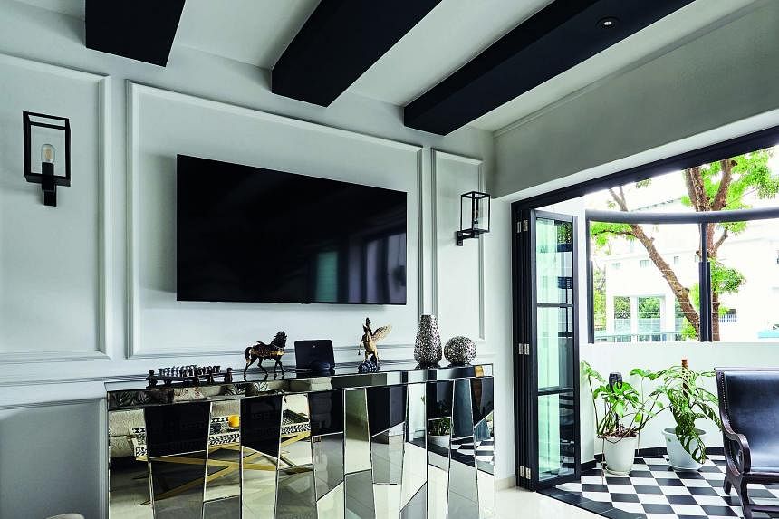
Since the owners wanted a black and white colonial style, using chequered tiles for the balcony was perfect. We laid them out diagonally to add depth.
For safety, we put invisible grilles horizontally, so as to not disrupt the space visually.
The owners love the natural light and breeze, so they did not want to cover the terrace. Instead, they decorated it with large potted plants that would thrive in the rain and sunshine.
What was the concept behind the bathrooms?

For the powder room and the children’s bathroom, we wanted to create the illusion of a bigger space, so the tiles had to be laid carefully. For the master bedroom, we went with an elegant and sophisticated look, opting for black-and-white tiles and gold trimmings.
Which is your favourite part of the home?
We love the bathrooms, the open kitchen and the living room with the beautiful balcony.
- This article first appeared in the September 2022 issue of Home & Decor, which is published by SPH Magazines.
- Get the October and latest issue of Home & Decor now at all newsstands or download the digital edition of Home & Decor from the App Store, Magzter or Google Play. Also, see more inspiring homes at https://str.sg/wrGK.