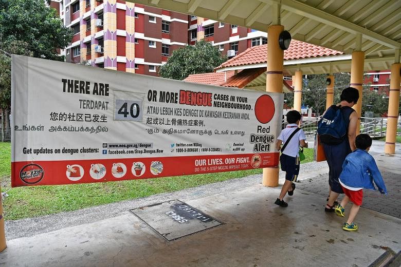
There are many "Our lives, Our fight" banners fluttering around Singapore during dengue outbreaks, but in terms of effective communications they fall short for the following reasons:
• There are too many elements in the banner without a focus. This breaks the basic rule of posters and banners, which can be summarised as producing something that "he who runs can read". The authorities should consider sending their staff to take a look at banners that have been put up, and note the number of people who "stop and stare", and actually read them.
• The banners are physically and strategically misplaced. One example I saw was a banner strung across a traffic light junction, which is not the right place for it as drivers may be focused on the traffic lights.
• They try to be inclusive, like most government communications, by including all four official languages. The result - a clutter of mismatched typefaces which discourages viewing.
• The Mozzie Wipeout steps highlighted in the poster may not work because the simple process of getting rid of stagnant water has been turned into something overly complex. The banners read like a brief from the authorities. Like all great advertising, they should communicate one basic message, such as Nike's "Just do it". If the dengue numbers are rising, then the authorities may need to re-assess past and current efforts on what works and doesn't work. But flogging a dead horse with fingers crossed is not the answer.
Danny Chow