
Selane, the font family developed for The Straits Times' redesign, has clinched the Wood Pencil at the prestigious D&AD Professional Awards 2016 in Britain.
The global D&AD awards, which celebrate the best creative work in the design and advertising industry, were announced last Friday. The Wood Pencil is the equivalent of a bronze award.
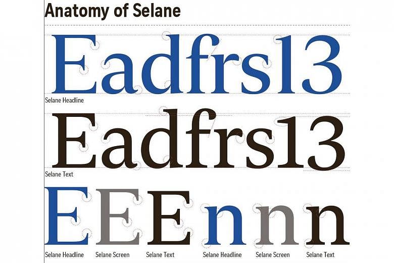
The winning font, Selane, is part of a family of typefaces developed for the ST redesign last year by London-based Canadian typographer Patrick Giasson, 43.
He worked with ST's design team, including award-winning designer Lucie Lacava, to develop and extensively test the palette of 29 bespoke typefaces over a period of 11 months.
The font, from which the current masthead has been derived, is now used across all of ST's platforms, including Web and mobile.
Font choice is a critical component of the design of any newspaper, impacting legibility, the look and feel of the stories, and even how many articles can fit on a single page.
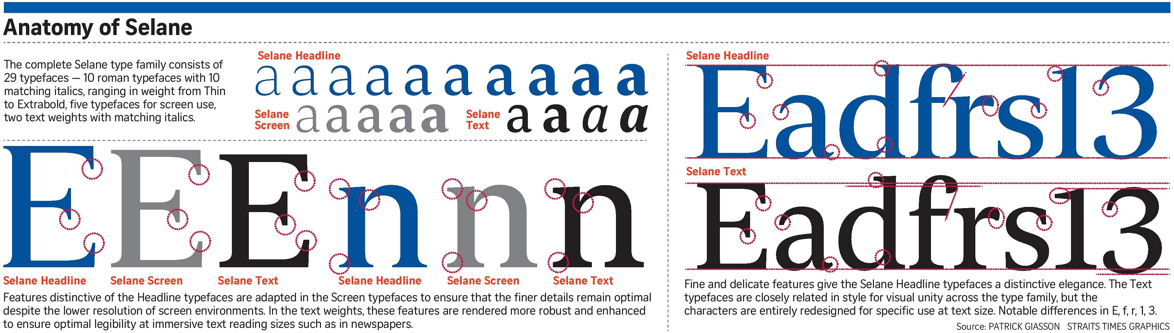
Mr Giasson said that as the fonts were being created, legibility was always at the top of his mind.
Selane, for example, is easy for both the young and old to read, and remains legible even when characters are placed close together.
The font also had to lend itself to everything from headlines to text for the story, and be versatile enough for all sections of both The Straits Times and The Sunday Times.
Separate sets of typefaces were also created for print and screen, so that details would not be lost in lower-resolution environments.
Mr Giasson, who has developed typefaces for publications such as The Times of London and organisations such as Google, added that advances in printing technology allowed for finer and more elegant features to be incorporated into the fonts.
"This type family takes full advantage of the possibilities of these recent improvements," he said.
This is the second award Selane has received. Last week, it beat entries from around the world to take a Silver award at the European Design Awards.
The ST redesign has itself received numerous accolades.
Earlier this year, it received an Award of Excellence for its redesign from the Society for News Design, as well as the Best in Newspaper Design and Best News Website awards from the World Association of Newspapers and News Publishers (Wan-Ifra).