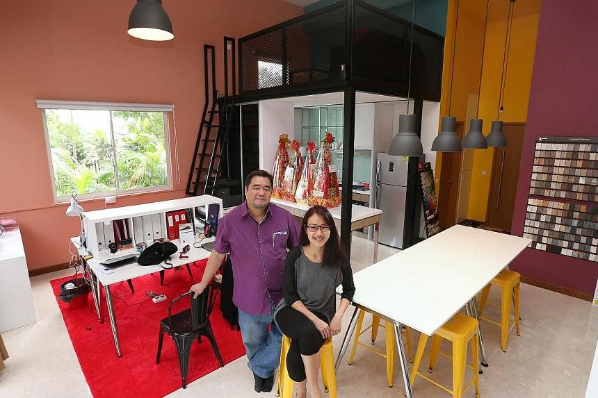
A kaleidoscope of colours fills the compact 660 sq ft Soho unit that houses interior design firm Free Quotation. The walls are splashed with fancy-sounding shades such as Red Feather, Private Lagoon, Royal Gold and Copper Orange - a bold experiment in meshing intense, bright hues in a single space. The company moved into the unit at The Greenwich condominium in Seletar last June.
The firm's design consultant Yee Shann Ling, 21, had originally planned to use Red Feather, a deep hue of red, on a feature wall, while keeping the other walls a neutral white. But the look turned out too plain, so she decided to go all out with the melange of colours.
Ms Yee, who works with owner and interior designer Raymond Choo, 42, says: "It's easy to stay safe with colours such as white and taupe, which many homeowners do. But it's also easy to use bright colours. It's just important to match the wall colours well with your lighting and furniture."
Indeed, unusual bright colours, which have been a staple on fashion runways, are making their way into homes.
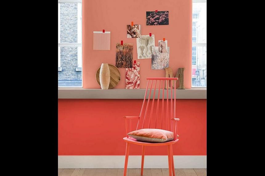
Dulux, which is managed by global paints and coatings company AkzoNobel, has trotted out Copper Orange as their pick for Colour of the Year.
Homegrown label Nippon Paint, meanwhile, has put out a palette of nine colours - there are six shades under each colour - which they expect to be popular over these two years.
American colour company Pantone has also put out its version of the 'It' colour to have on walls this year - a reddish-amber, spicy-sounding tone called Marsala. The company's colour predictions are visible in many industries beyond home and decor, such as fashion, consumer products, graphics and packaging. Last year, it picked another bold colour, Radiant Orchid, a fusion of purple, pink and fuchsia.
Mr Jeremy Rowe, managing director for AkzoNobel Decorative Paints in South-east Asia, South Asia and the Middle East, says a panel of experts look at various industries - from fine art to technology, design to nature, architecture to fashion, and music - and eventually pick a colour for the year.
This year's colours tend to be vivid - and it appears that the trend towards bold colours is becoming more popular with Singaporean homeowners as well, say interior designers who Life! spoke to.
It is something Mr Rowe does not find surprising. He says in reference to Singapore: "It's a unique market in that there is a high degree of home ownership and these owners tend to be young. That's why more consumers nowadays are prepared to experiment with new and trendy colour choices."
Mr Ken Lee, 39, principal designer at interior design firm Space Matters, concurs, saying that while many of his younger clients start out opting for a less risky route with clean interiors and neutral colour palettes, he has noticed more of them being open to the idea of bolder colours upon his suggestion.
He says: "People might initially see it as a risk, but the truth is, it doesn't need to be if you plan your space carefully."
His advice for someone looking to introduce colour into his home? Single out spaces that can create impact. These can be long corridors, cosy nooks or large horizontal surfaces that can serve as an accent wall.
"What you want is to create a point of interest in your home. That way you can introduce colour while balancing the rest of the space with more muted or neutral tones," he says.
Another option, according to Mrs Barbara Fritschy, 37, founder of interior design firm Make Room, is to find a statement accessory you love and use that as a point of inspiration.
"Settling on just one colour can be daunting, so using a piece of furniture or a painting with a dominant colour is a great way to get inspired," she says. "You can then tie the room together with accessories in the same colour family."
Opting for boldly coloured accessories is something that Mr Arjan Nijen Twilhaar, 43, principal designer at interior design firm Aiden T, also encourages his clients to do, since it is a low-risk way to change the look of a home.
He says: "You're adding colour and conversation pieces, while not doing any permanent changes to the colour of the walls. So it's fail-proof."
But for those ready for a bold change, Mrs Fritschy suggests going all out, starting with a paint job in a statement colour.
A good place to start? The wall in the living room on which you intend to mount the television set.
"You usually don't add paintings or wall accessories on that surface as it can be distracting, so it serves as the best backdrop for a statement colour," she advises.
Painting your walls is also the best way to test your tolerance for colour, given that it can be reversed more easily than adding wallpaper or textured surfaces such as quilted backdrops.
"Once you've decided you like the colour for your room, you can think about giving the space an update with more permanent features such as wallpaper or textured surfaces in the same colour," Mr Lee suggests. "It's better than deciding on wallpaper at the start, but then incurring costs to remove it later if you want to change your room."
But outside of paying attention to the size and space in the room, homeowners should also consider the amount of light the room has before adding bold colours, says Mr Lee.
"Dark colours should be used only if the room has lots of natural light or sources of artificial lighting. Colour and lighting go hand in hand, so without adequate light, the room might end up looking a lot smaller than it really is."
Another way to prevent your home from looking choppy and incohesive is to stick to complementary colours on adjoining walls.
Complementary colours can be identified as those near each other on a colour wheel, whereas colours that are opposite each other on the wheel are contrasting colours.
Colour wheels - available at interior design firms and paint stores - are a circular diagram where related colours are arranged next to each other.
"Sticking to complementary colours will help tie the room together - making it look more cohesive and inviting," says Mrs Fritschy.
"You can then add final touches with accent pieces such as coloured furniture or fabric piping in the same colour family."
At the end of the day, using colour is really a matter of taste and preference and, hence, should not be rushed.
Mr Lee says: "It's best to take your time to find out which colours you love and update your space as you go along. That experience will make the space feel more cosy and ultimately is what will turn your house into a home."


