(NYTIMES) - In these dark, chaotic times, it would not be unrealistic for someone, when asked what colour will represent 2018, to look around and guess, say, black. Or maybe deep, bloody burgundy. Wartime red? Fake-tan orange? At the very least, soot grey.
Any of them would seemingly match different shades of the general mood.
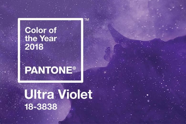
And yet the self-proclaimed "colour authorities" at Pantone sent approximately 10 people to blanket the globe for weeks at a time last year, searching for colour signals in food, cars, cosmetics, clothes and housewares. They reconvened, pooled their findings, did their analysis and declared the colour of 2018 to be … Ultra Violet.
Huh?
Yup, the highlighter-purple shade that has also been the name of a Warhol superstar who died in 2014; a 2006 dystopian action film starring Milla Jovovich as a rebel infected with a vampiric virus; an online activist community founded in 2012 to combat sexism and violence toward women; and a kind of light that can cause skin cancer (ahem).
Those things may not be exactly what you think about when you think about what's coming, but the history does demonstrate that the idea has a broad reach. Ultra Violet can be many things to many people.
It "communicates originality, ingenuity and visionary thinking," Leatrice Eiseman, executive director of the Pantone Color Institute, said by way of explanation. It is found in the cosmos (think of all those swirling purple nebulae!), the wellness movement (amethyst crystals!) and was a favourite colour of the architect Frank Lloyd Wright, who, Ms. Eiseman said, used to wear a purple cape when he was trying to be creative. Ditto Wagner, who liked to surround himself with purple when he was composing. Also, of course, Prince.
It's also the most complex of all colours," she said, "because it takes two shades that are seemingly diametrically opposed - blue and red - and brings them together to create something new."
That's an optimistic view of things. And, if the current standoff in Washington is any indication, one that seems more like wishful thinking than reality. But that, it turns out, is part of the point. At least this year.
"It's truly a reflection of what's needed in our world today," said Laurie Pressman, vice president of the Pantone Color Institute. Not, note, "what's going on in our world today." Which is kind of an interesting distinction. It suggests that Pantone is not just observing and predicting, it's going proactive.
In the past, Pantone has skewed more reflective. In 2015, for example, it took the relatively radical step of naming two colours for 2016: rose quartz and serenity, a pink and a blue, in acknowledgement of our increasingly gender-fluid world. Last year, it went for a green tone to suggest new beginnings (and quite a beginning this first Trump year has been).
But for 2018, Ms. Eiseman said, "We wanted to pick something that brings hope and an uplifting message." This is effectively the colour-psychology equivalent of the theory that says that when you make yourself smile, you feel happier. Or the "Field of Dreams" mantra: "If you build it, he will come."
In the Pantone version, if you wear it/drink it/drive it, solutions may appear. That's a pretty ambitious belief. Will people buy it?
Well, at this stage, a lot of us may try anything. Gird yourself. We may be in for a new kind of purple reign.